The Vision of Inquiry
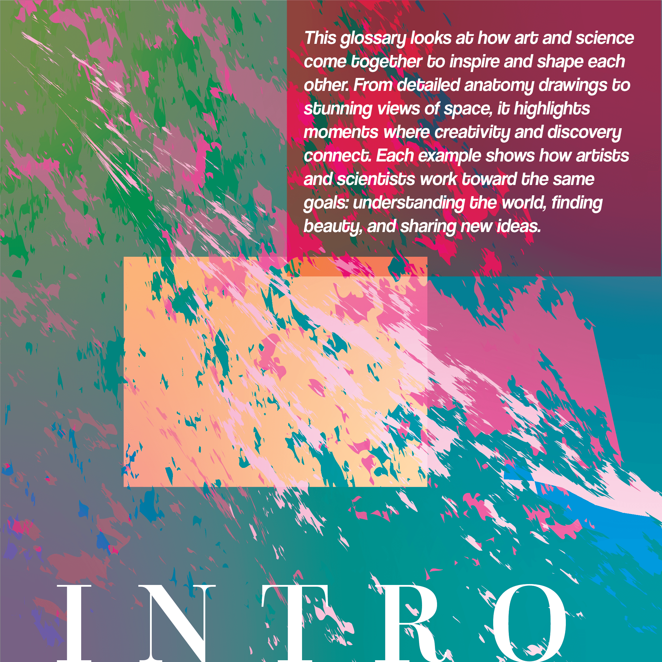
Anatomists needed artists. Astronomers needed illustrators. This is a glossary of 52 scientific and artistic concepts, A to Z; where science and art collide.
Print and Editorial










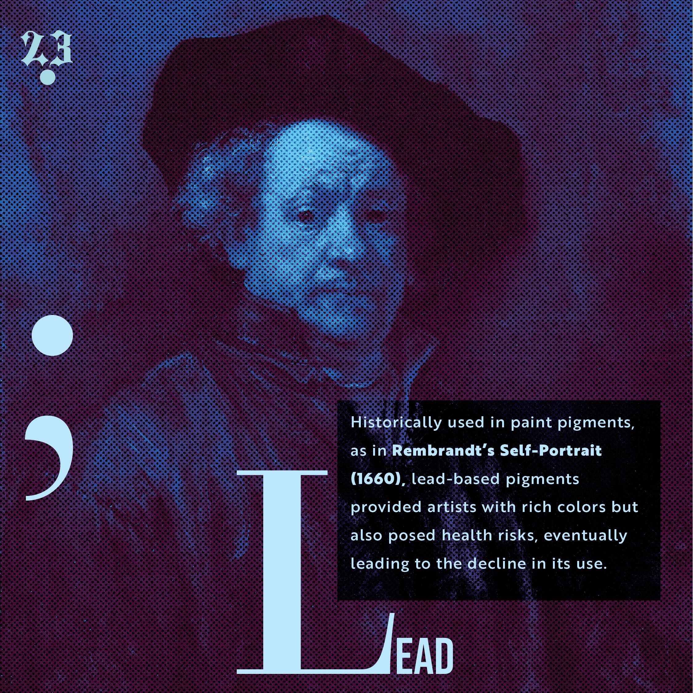


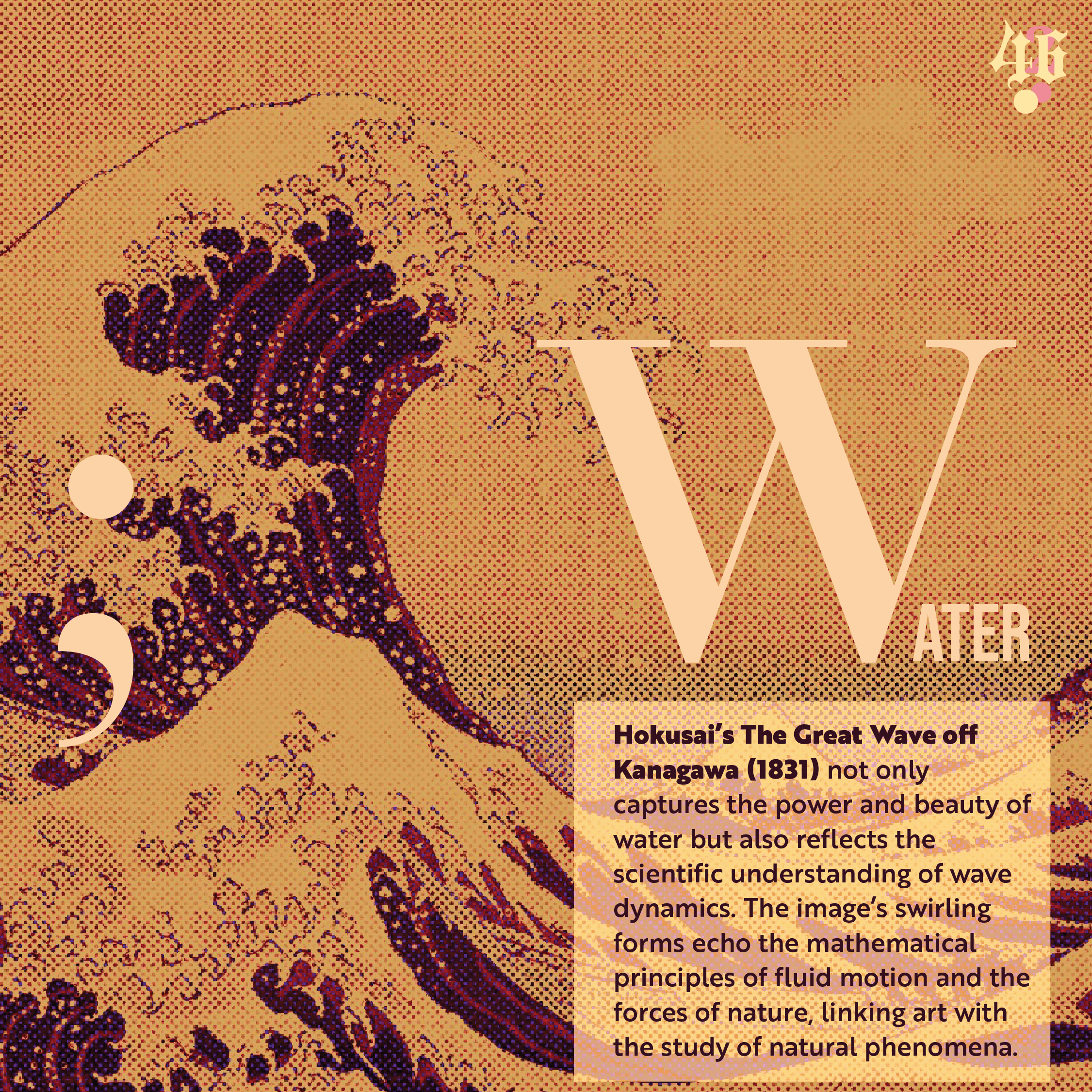
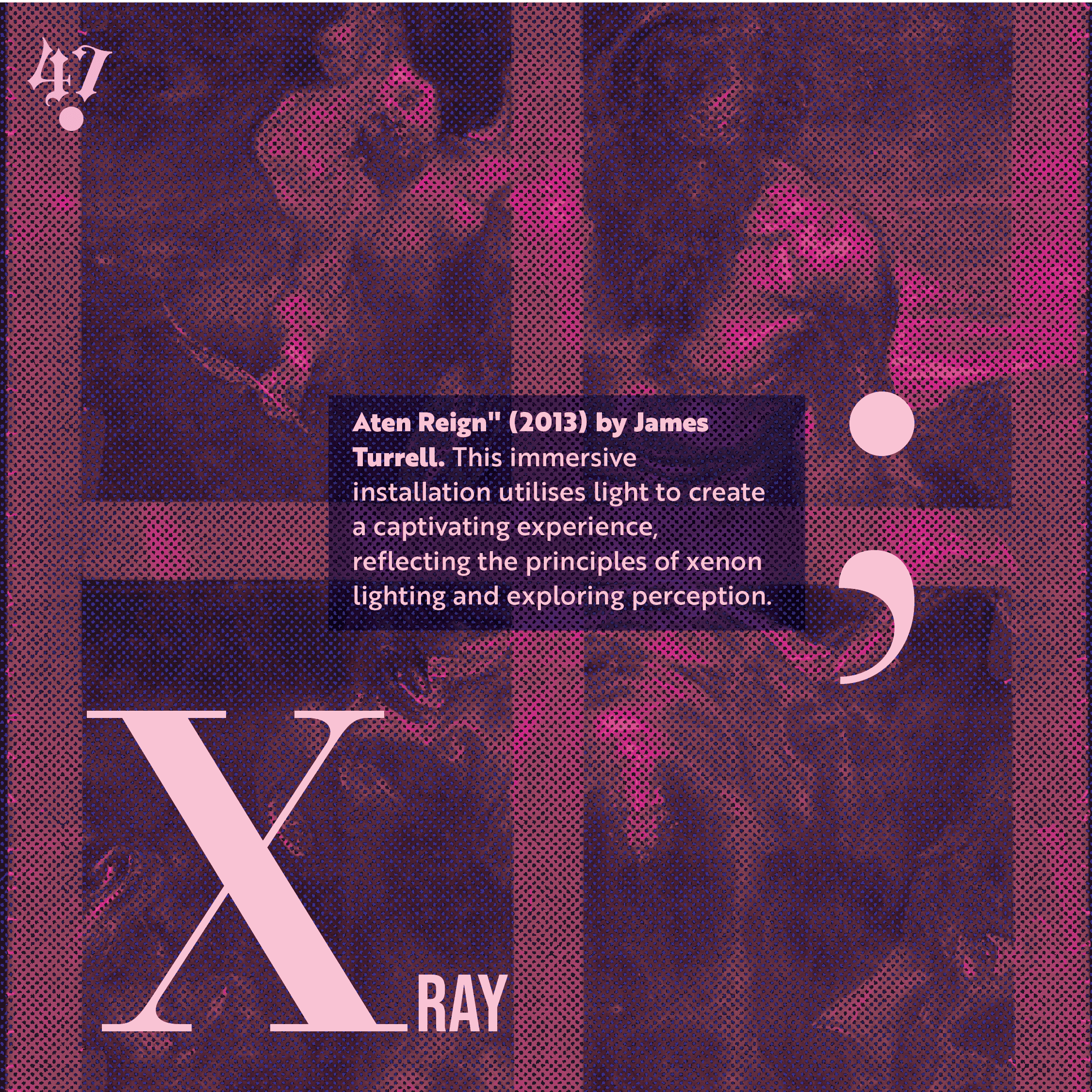


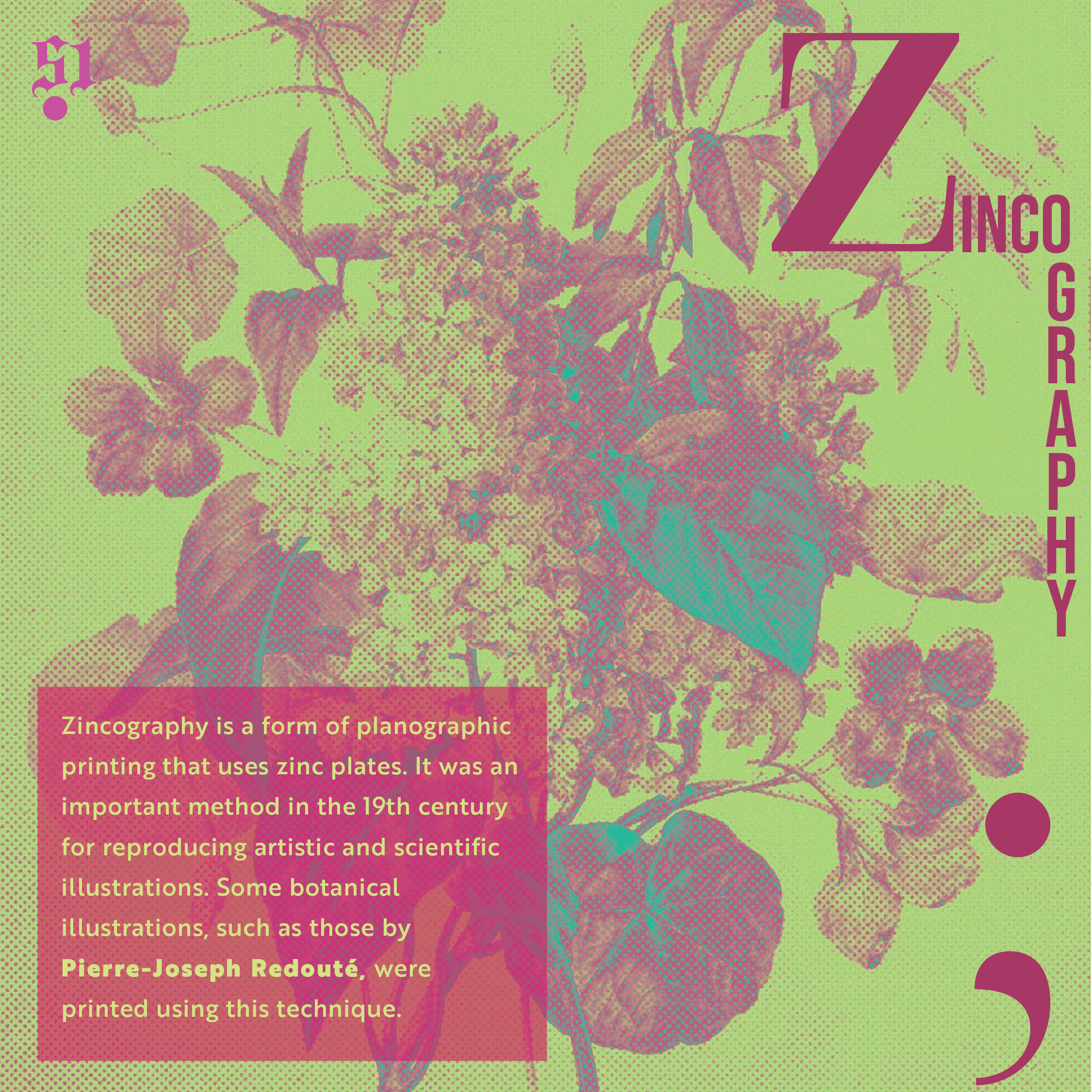


Click on the book
Anatomists needed artists. Astronomers needed illustrators. This is a glossary of 52 scientific and artistic concepts, A to Z; where science and art collide.
Print and Editorial
Click on the book
Science and art have never really been separate; anatomists needed artists to record what they saw, and astronomers needed illustrators to map the sky. This glossary builds on that relationship, pairing 52 scientific and artistic concepts across the alphabet, from alchemy to zoology.
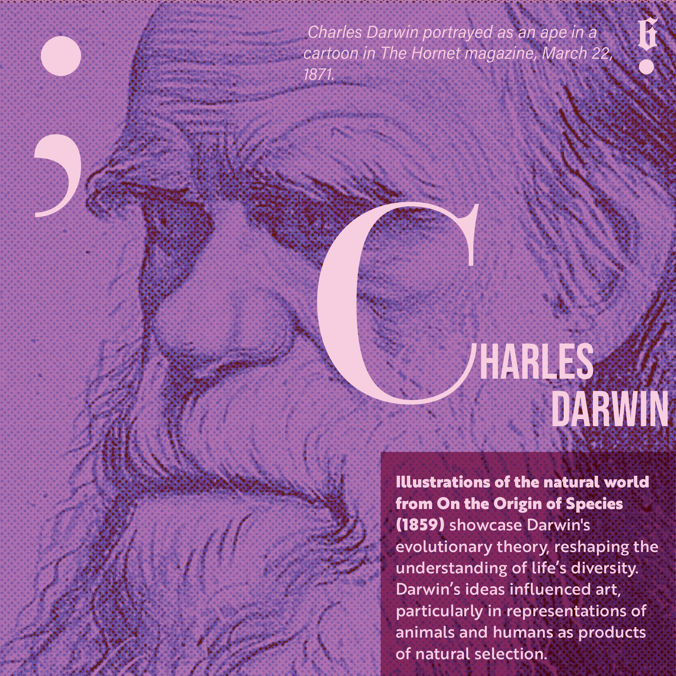
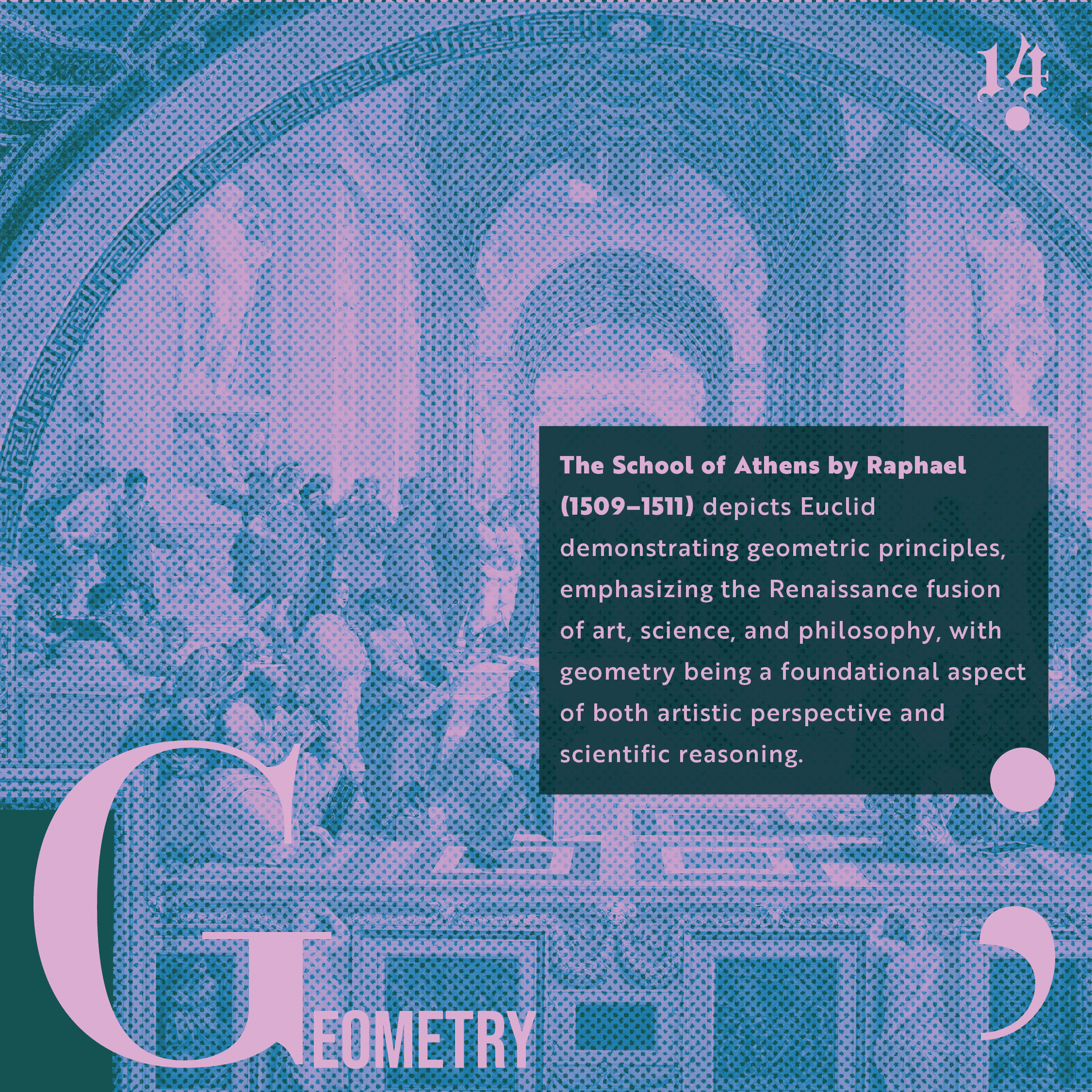
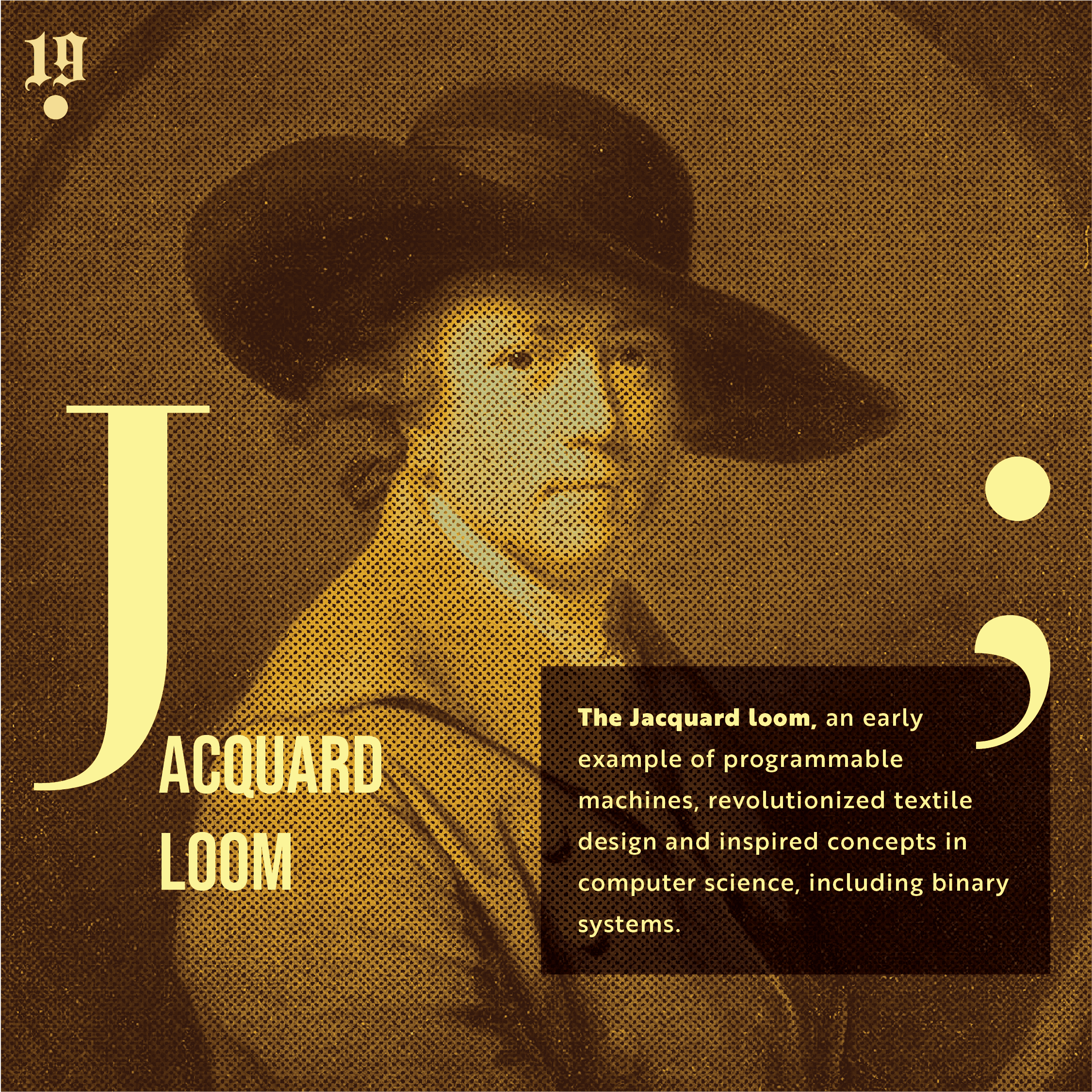
Each entry sits on a historically significant artwork or scientific illustration rather than an invented one. No grid system holds the layout together, since science and art were never meant to fit inside a conventional box.


Work began with identifying 52 concept pairs, each grounded in a real historical artwork or scientific illustration spanning astronomy, anatomy, botany, and beyond. Sourcing these visuals meant digging through archives and museum collections for pieces carrying enough visual weight to anchor an entire spread.
Once the pairs were locked, focus shifted to typographic hierarchy to how much space each illustration needed to read clearly against the type. Layout decisions were tested against one idea: no single grid could hold 52 completely different visual sources together. That constraint pushed every spread toward a duotone treatment instead, since colour reduction was the one variable flexible enough to unify
such varied imagery.
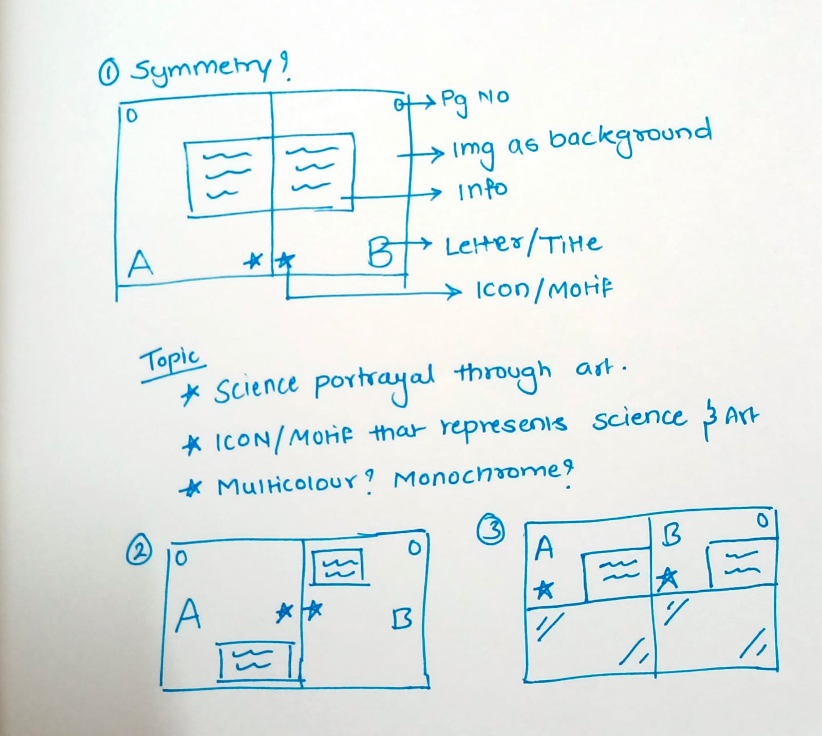
Six typographic directions were made before landing on the final system; they were negative-space blackletter cut into monochrome bars, glowing gothic type suspended in gradient light, and oversized single letterforms lit against a radial glow. Full-bleed imagery, split-column composition, and type-led layouts were explored alongside these. Some iterations gravitated towards more saturated colours like violet, sage, and magenta, while others stripped back to pure tone and silhouette. The letterform scale was adjusted repeatedly so the display type never competed with the artwork underneath it.

The final system runs on a consistent duotone treatment: two colours held in tension, one for the empirical language of science, one for the expressive language of art.
Applied uniformly across all 52 spreads, it gives every page the same visual DNA regardless of source material – Rembrandt, Escher, and da Vinci, all under the same rule. The absence of a fixed grid becomes part of the concept rather than a gap in the system.
Constraints, when chosen on purpose, become the strongest design tool available. Duotone wasn't picked because colour wasn't an option; it was picked because saying more with less forces every other decision to earn its place. Building one system that could hold 52 unrelated sources together mattered more than perfecting any single spread. Skipping a conventional grid reinforced the idea driving the whole project: science and art were never meant to sit inside a neat box.